10 charts to farewell 2021: Charts of the year
Working from home, inflation and the curious case of the Australian home.
It’s been a busy year for chart makers. New case numbers bombard our screens daily. Rising inflation is forcing Y-axes around the world to reach levels that have not been seen in decades . To commemorate the year end, we asked the Morningstar team to pick out their favourite charts from 2021—the interesting, the weird and the unexpected.
Today’s ten charts bring new twists to some of the year’s biggest stories, from the impact of age on inflation to covid’s effect on influenza. They also highlight stories drowned out by the drumbeat of covid, like the curious case of the Australian family home.
Stopping an economy in its tracks
As laboratories scrambled to test vaccines back in 2020, policy makers were running their own experiments. Offices shuttered and workers were sent home as governments hit pause on their economies. The collapse in economic activity in the UK was unprecedented, says Morningstar UK editor, Ollie Smith:
“It’s a stark reminder of just how catastrophic coronavirus was for the UK economy," he says.
"We shouldn’t be deceived by short-term “bounce-back” projects. The whole affair is, in GDP terms at least, unlike anything at occurred during the Great Financial Crisis of 2008.”
Covid killed the influenza star
That experiment triggered unintended consequences across the globe: air pollution plummeted as engines went silent; a rush for toasters and TVs by home-bound populations shocked global supply chains. Of them all, the disappearance of influenza stuck with Morningstar equity analyst Angus Hewitt. The disease normally notches more than a hundred thousand cases annually but anti-covid measures cut that to near zero.
“Who would’ve guessed? Measures to contain a highly contagious respiratory disease contained a highly contagious respiratory disease” says Hewitt.
The death of the office has been greatly exaggerated
Covid hit commercial real estate hard. New buildings stood vacant as companies sent workers home. The move to working from home sparked claims that the end of the office was nigh—farewell to commutes and shared workspaces.
Not so, says Morningstar senior equity analyst Alex Prineas. His favorite chart this year shows how the supply glut remains small by historic standards. Australian tenants continued to snap up floor space in 2021, with sales just short of the records notched in 2019. Expect the office to stick around for years to come.

Two sides of the ESG coin
2021 was a complicated year for fossil fuel investors. Renewed commitments to cut emissions at the COP26 climate conference came as soaring fuel prices delivered mega-returns for the energy sector.
Coal typifies the unusual situation, says Morningstar director of equity research, Mathew Hodge. Even as Australian banks cut back lending due to ESG concerns, coal miners like Whitehaven Coal are up more than 50% year to date thanks to the highest prices in a decade.
“It goes to show that with ESG becoming a bigger focus for governments, companies and investors, not all of the outcomes will be intuitive,” says Morningstar director of equity research, Mathew Hodge.
However, high dividends tend to come with environmental, social and governance risks according to the favourite chart from Morningstar data journalist Lauren Solberg.
In the US dividends and ESG risk intersect in the oil giants Chevron and Exxon. At home, it's miner's like Rio Tinto, where chief executive Jean-Sebastien Jacques stepped down last year amid a scandal over the miner's destruction of sacred indigenous sites in Western Australia.

Inflation, inflation and more inflation
From Morningstar’s editorial director Sheryl Rowling, editorial manager Emma Rapaport and myself come three charts on the story that markets just can’t kick: inflation.
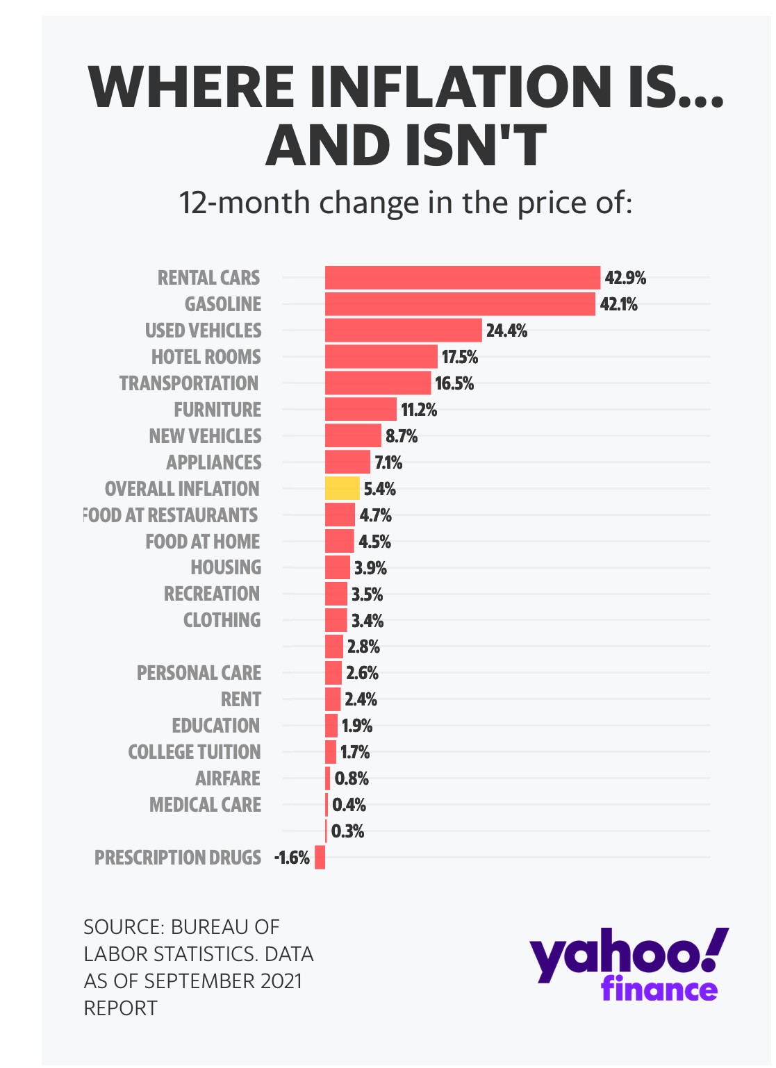
Behind the headline inflation number are thousands of individual prices and Sheryl’s favourite chart divided those into the major categories. The case for US inflation fading rests on the double digit jumps in cars, hotels and gasoline fading in the new year. It's a simliar story at home. Stay tuned.

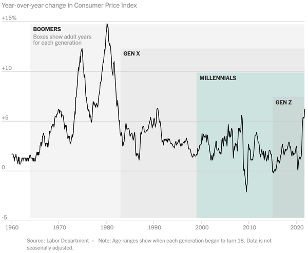
Emma’s favourite chart put rising prices into a generational context. Published in The New York Times, it shows why the lived experience of younger investors may make them more sanguine about today’s inflation than their parents or grandparents.

Source: New York Times
For myself, it's all about the Federal Reserve. Few changes this year have been as dramatic as the about-face at the US central bank. When the bank's decision making committee met this March, most members forecast rates to remain near zero into 2022. Fast forward nine months and three rate hikes are now expected next year.
Australians back cutting pension benefits for the wealthy
The family home occupies a special place in the Australian psyche, so editorial director Graham Hand was surprised to find so many people were willing to include it in the age pension asset test. Doing so would cut benefits to pensioners in multi-million-dollar homes, and a good thing too, Hand argued in his article: ‘10 reasons wealthy Australians shouldn’t receive welfare’.
“I thought it was not such a mainstream subject and would garner a limited response, but it was the biggest article of the year…. It was one of those that really hit a nerve.”

The many tendrils of Chinese property
From Hong Kong, data journalist Kate Lin shares a chart from Goldman Sachs showing the myriad ways Chinese real estate impacts the world.
The debt crisis at Evergrande put the sector under the spotlight this year but the impact extends far beyond any one developer. Real estate is implicated in 20% of China's GDP while a third of all loans are to developers or buyers.
Then there's the international spillovers. Chinese property consumes roughly a fifth of global steel and copper. Property developers issued a quarter of China’s offshore US dollar bonds.


